Client: DesignLab
My Role: Interaction Designer, UX Researcher
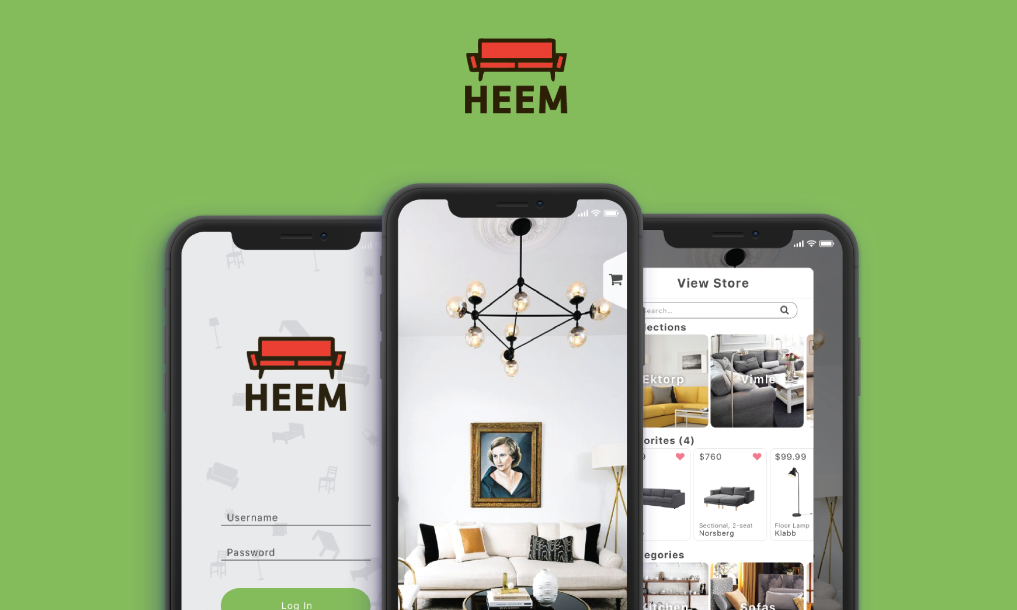
Background: Heem is a new app for interior design. They have partnerships with a number of top-ten furniture stores in the US. It’s now time to start designing the app. Heem is not the first one doing a AR furniture app. However, they aim to do it better, and bigger.
Objective: Create an end-end mobile application that will allow users to try out new furniture in their homes using augmented reality, make purchases and set up delivery.
Stage 1: Research
Competitive Analysis
To kick off my research phase I explored three other AR-based interior decorating apps - Amikasa, IKEA Place, and Housecraft. I tallied up all their features in a competitive analysis and decided which ones I should include in Heem.
User Survey
I created an online survey through Google Forms that was a mixture of multiple choice and short answer asking about people’s shopping habits. My objective was to discover the preferences of people who buy furniture, whether they prefer to go to a store or shop online, and what they like and dislike about both experiences.
I received a total of 70 responses providing a large data set to analyze. Buying furniture online, while convenient and fast, is still not a replacement to going to a furniture store, especially for larger items. The inclusion of AR when shopping online can help bring us one step closer to be able to do a lot of furniture shopping online, because users will be able to see if something will fit in their space without leaving the home.
Stage 2: Define
User Persona
After completing my primary and secondary research I created one final user persona, Sam, a physical therapist who is looking to buy a couch from IKEA with her husband. I use personas when making future design decisions to also keep my audience in mind and have a reference to look back to quickly.
POV Statement
Today’s consumers still struggle with online shopping when it comes to furnishing their homes. They are afraid of not knowing if something will fit in their space, or if it will match their decor. With Heem’s new AR interface, we take the guesswork out of purchasing furniture. Users will be able to select items from leading home furnishing brands of and view how each piece will look in reality, to scale. Heem will serve as one-stop shop, allowing users to purchase items in-app, set up delivery to their homes, and bridge the gap between the in-store and online experiences.
Feature Matrix
For this feature matrix I included the list of features and options I want to have for the Heem AR app. Much of this was based on my competitive analysis and what I found to be lacking in other AR apps. I also included the priority, difficulty to implement, and if this feature can be found on an already existing app.
Customer Journey Map
Continuing my design process, I mapped out Sam's journey of buying a new couch for her living room using the Heem app. I read articles and looked at examples of other journey maps before designing this. I also included an empathy map for her emotions. Having a journey map helps to empathize with the user’s wants and needs.
Application Map
The application map contains all the existing screens of the Heem app and shows the order of the screens. The boxes highlighted in blue are the pages I intend to design. This provides me with the skeleton and basis for which to start creating my screens.
Stage 3: Design
Sketches
My preliminary sketches for the key 6 screens to be shown for the application. I decided to design my app for the new iPhone X, since that phone comes with a built-in AR system. These served as the basis for my wireframes, and eventual final UI.
Wireframes (Key Screens)
Logo
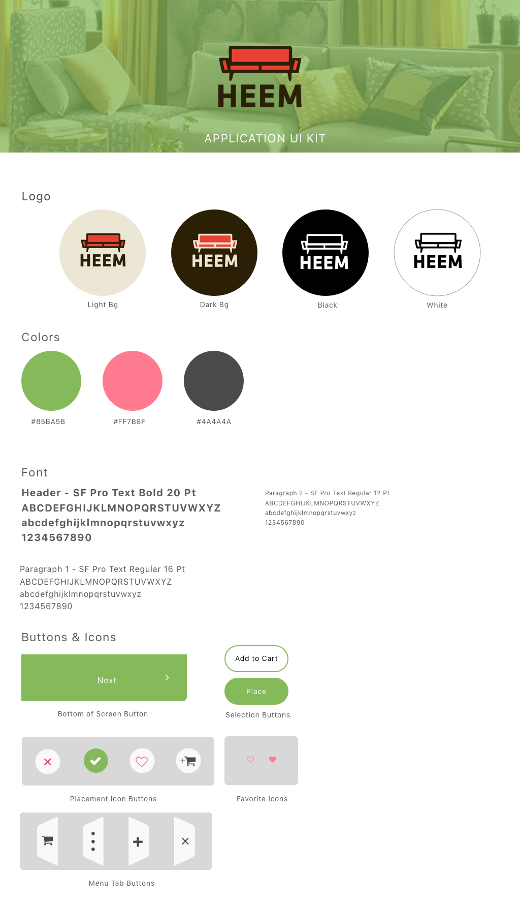
For the Heem logo I went with a graphic interpretation of a mid-century American couch paired with thick sans-serif text. I wanted the logo to be fun and use a bright color that would pop on the screen and catch you eye. I made versions of the logo that work on both a light and dark background.
Final Key UI Screens
UI Kit
Stage 4: Test
Prototype
I created a clickable prototype using InVision’s prototyping tools. I then carried out 6 moderated tests using volunteers to see how successful the complete flow is to end users. I compiled all my results and data into a document.
Affinity Map
I summarized the results of all moderated user tests with my InVision prototype and came up with some key feedback notes. These are the main points I took away from my testing stage and what I can do in the future to improve the Heem app and continue to grow.
The future of Heem...
The future of Heem is bright. These are some of the features I want to add to this continually expanding project:
Landing Page for Heem, info about the app
Animation of UI elements
Incorporating VR technology to Heem, pushing it to new fields of the latest technology


